

Exploding text
The effect makes really hot and fiery exploding background to the text.
Also take a look at other Photoshop tutorials...
Red tissue | Modern Art in Blue | Flawless Collage of two Panorama photos | Making sepia hue | Weathered stamp/flyer |
Exploding text
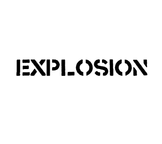
1. Write in black with Type tool on white background. (we are in a grayscale mode, right? If you are currently not, swich to it by Image/Mode/Grayscale)
We are using this font - click here to download.
We are using this font - click here to download.
2. Layer/Rasterise/Type
(This converts a vector based text into a bitmap, or we can say to a picture. It is essential to do this for we can not work with vector text in so many ways as with bitmap. Further on, we will smash the bitmap to pieces and that would definitelly be impossible in vector form. Clear.)
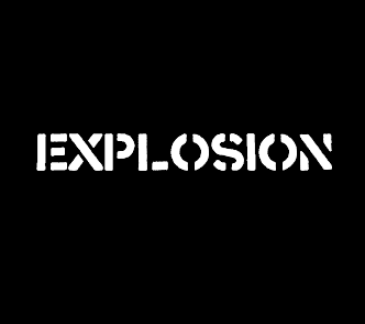
3. Layer/Flatten image (This joins all layers, making just one picture with both white in back and black text in the front.)
4. Image/Adjustments/Invert, or Ctrl+I
(By that we have just inverted the colors, black to white, white to black. Just like in politics, right?)
(By that we make the same layer again and is basically the same thing as Copy Paste.)
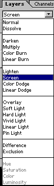
6. Swich layer mode of the upper layer to screen.
What was that? What does that mean? Well, I plan to make a tutorial on these later on, but generaly, the Layer Mode information states how does the layer where you set it interact with the layer directly under it.
To make an example, if you tried to use white writing on a dark background while the layer modeis set to Screen or Lighten, it will lighten the image under it.
The other extreme is white writing on black background, while Layer mode is set to Multiply (what makes the top layer darken everything under it proportionaly to its lightness - the darker the top layer, the more it will darken the lower layer.)
So in our example, we use Screen mode to lighten things under it and to make it look better.
7. Edit/Free transform, or Ctrl+T and enlarge the upper layer a bit, holding Alt (that causes the distortion to come from the center) and also hold Shift (what causes the distortion only to increse the size while the proportions will be kept the same.)
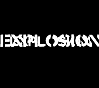
8. Filter/Brush strokes/Spatter (15, 3)
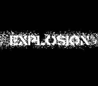
This effects breaks the object into tiny little pieces and scatters them around just like when you break window. Nice effect though.
9. Filter/Blur/Radial blur, (52, zoom, good)
This creates a zoom like effect that looks like the small paricles from the Spatter effect are being thrown to all sides.
Also put the bigger layer behind the smaller one (the crashed one behind the original text). You will move the layer just by Drag and Drop in the Layers pallete.
Also put the bigger layer behind the smaller one (the crashed one behind the original text). You will move the layer just by Drag and Drop in the Layers pallete.
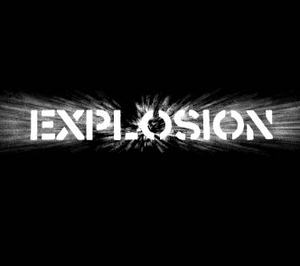
Looks interesting, doesnt it? But we have only the shape, not the color. So we will do this:
10. Image/Mode/Indexed color
(In this mode, you can attribute different colors to the degrees of grey. We will choose the Black body for it consists of red, yellow and black - all fire like colors).
This function is often used for transition from Grayscale picture into one with only limited number of colors.
There is one discrepancy that may occur. And that is when you are for example in RGB mode and you try to use Indexed color. The result will not look very nice. This is due to that the color information is still in the picture. The thing is that Indexed color doesnt like dealing with colors so we will have to swich to the Grayscale mode as the first thing, and only then to Indexed color. I hope it is clear. I know it might sound a bit too advanced but now you have also this advanced knowledge.
Feels good, doesnt it ? :D
11. Image/Mode/Color table, set Black body
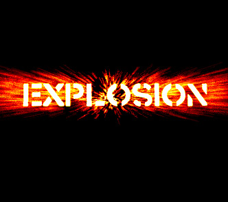
Hot enough, isnt it? I like the outcome and I used the similar procedure in the Burning Text tutorial.
Enjoy.
And if you happen to have a good idea of a tutorial (that is REALLY yours), you might wish to send us the procedure in text form and/or pictures and we will place it on our site. Be proud of what you can do.
Enjoy.
If you liked this tutorial (or even if you didnt :) please make a Comment and Vote in the section below.
Thank you.
Submitted by Martin on 2006-03-07 16:41:50. Since then read 74173 times.
Scored 2.99 points out of maximum 5 by 125 votes.
Also take a look at other Photoshop tutorials...
Create a kite shield in Photoshop | Lightning Effect | Easter Eggs in Photoshop and ImageReady | Alien text | All about Layer Mask |
Rate this tutorial!
Invite a friend!
Discussion
Curtis C DOT u DOT r DOT t AT hotmail DOT com said on 2006-04-21 08:29:13This is Amazing man, 10/10 for sure. LOVE IT! Id like to see your other tutorials for text :)
Martin mato AT t-tutorials DOT com said on 2006-04-21 19:47:50
notnig easier. just click in the left navigation panel on TEXT EFFEXTS and you are ther. I am glad that you liked it. I surely will create some more such text tutorials :D
SooUnreal Unrealdude AT hotmail DOT co DOT uk said on 2006-04-25 11:37:09
How do you add a new text to photoshop?
Martin mato AT t-tutorials DOT com said on 2006-04-25 15:31:30
I guess that what you mean is how to add NEW FONT to WINDOWS. Well, it will install itself automatically, as soon as you copy the FONT file, in this tutorial it is CRASS.TTF into the folder FONTS that is located somewhere in WINDOWS. As soon as you copy it there, the system installs the font and you will be able to use it in any application that works with fonts. If any other problems arise, leave comment or mail.
Sad artur_boschi AT hotmail DOT com said on 2006-04-27 02:47:01
Very nice tutorial... But I couldn't do step 10 and 11.. I think there is something going wrong, maybe not same photoshop version, because I can't find some things. I use photoshop cs 2. Could i have your MSN adress or sumthing like that? thx sorry... english is not m best :
Martin mato AT t-tutorials DOT com said on 2006-04-29 20:59:09
Well, I use mainly PS7 but I have tried to do the same thing also in CS2 version. There was no problem. However, one discrepancy may arise when you are not in the Grayscale mode and you try to swich to the Indexed color. I will send you mail to explain it further, right?
Vic said on 2006-05-04 19:15:57
kick ass text thnx ^-^
Zen Zen AT tibet DOT com said on 2006-05-07 20:17:35
GREAT! The best tutorial i've seen so far anywhere! I'm talking about the detailed explaning, not the effect itself, (thow its a good one). Really, really well written, good job man, keep it up!
Woad said on 2006-06-22 22:16:51
Just text with an EFFECT behind it.
Shawn S_Steenveld AT hotmail DOT com said on 2006-10-10 07:15:37
i have the same problem with the version and inveting color. i use CS2, can u send me an email with the fix and maybe update the tutoial with a note on teh side or something for future users. thanks turned out awesome
Logan chubbychueb AT msn DOT com said on 2006-12-11 07:16:16
I love how this person explains what the different things do. Good Tutorial!
Nathan margerask8r AT yahoo DOT com said on 2008-07-31 18:57:35
This was fucking awesome! I added a radial blur along with the zoom blur to make it look like a shockwave!
simon said on 2008-09-10 03:51:57
Well it's great except you really didn't word anything correctly, I use photoshop alot and I could barley understand your instructions, plus there is a MUCH easier way to get this effect why dont you check for it somewhere
Gary info AT 3hamms DOT com said on 2009-11-17 01:09:24
I'm wondering is there a way to add a different colors instead of the red/orange/yellow. Great step by step ...