

Creating a stylish portfolio
Get some ideas on how to produce a nice presentation of what you have designed to be shown to your possible employers.
Also take a look at other Photoshop tutorials...
All About Adjustment Layers | Blue Matter | Red tissue | GOLD - the golden writing | Post-it-note |
Pages
Introduction
Dear reader,this idea came into my mind when I was offered a job for a company, to produce a website. Not a big deal, but I have done many websites before, so they asked me for my references. Well, I never worked commercially, so it was high time to make my own portfolio.
So, we need to realise that company is going to decide between several designers applying so you need to do your best. Therefore i think, the portfolio should look like innovative, not just: "On this site I did this, used these technologies and it was fun."
So why am I writing this? You might be in similar situation, so lets get inspired! Please note that in this tutorial, idea is more important than the method used which is quite simple ad easy - maybe...
Stylish reference page - portfolio
This can be used for anything. I use it to present my websites, but you can also present your products of any kind. Lets start!
Screen Shots
Fist of all, we need to get screenshots of your websites. I have several ideas that might be useful:- close all other windows, we are not interested in apps you use
- close all strange apps in system tray
- disable your weird system theme
- use some default (lets say standard) browser like Internet Explorer (or FireFox without theme)
- navigate directly to the first page, if it has intro page, skip that one, they want to see "the real stuff"
- if you are going to do more, keep the same settings (browser, screen resolution, theme...)
- disable your customised toolbars in your browser
How to take a screen shot? Easy. On the keyboard, when you are ready, just press "Print Sc" or anything that stands for print screen. Now you have your whole screen content in your clipboard. To recall, use paste, CTRL + V. Sorry, but I have no idea how this works ion Linux and Mac systems. Send me one machine so that i can try that out :) Thank you! Seriously, leave a comment in the discussion. Even I want to know it.
Lets go!
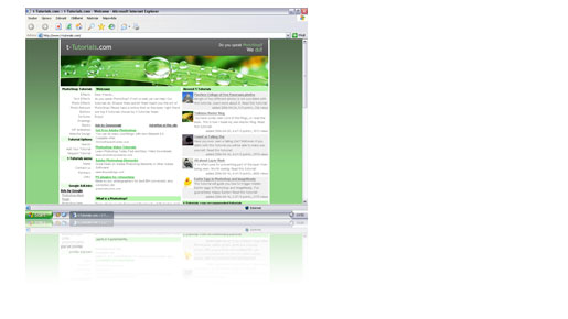
Open your Photoshop, create new document. It should have the settings of your screen resolution, if not, switch to pixelsand input your settings. Now paste it in to the window using CTRL + V.
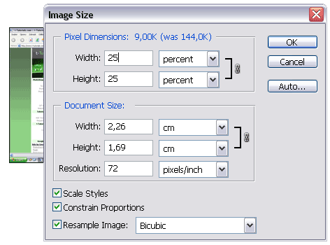
I think we could reduce to 25% going to Image -> Image Size... where we switch to percents and change both to 25; for example.
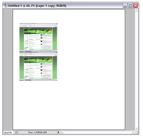
Now create a new document where we will put everything. Width could be 750 to fit even 800x600 resolution if you are going to publish it on web. Select Move Tool and move image to the new document. Nice. Duplicate the layer using Layer -> Duplicate Layer... Now move the new layer underneath the original one as shown on the picture.
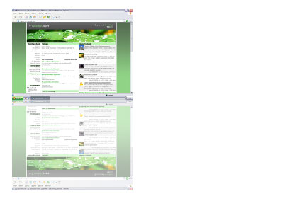
Now we will need to flip the layer so we create a reflection. With having the duplicated layer selected,
go to Edit -> Transform -> Flip Vertical. Cool! The reflection is not that strong so reduce the layer
opacity to 50%.
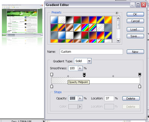
Now we can use gradient overlay to make the fade out - a reflection. Again, with having the second layer selected apply a Layer Style -> Gradient Overlay... I selected Reverse for easier manipulation. Set the gradient (double click). Change both colours to white - #FFFFFF of course. What we will mess with more is opacity. Change the left one to 0%. Keep the right one to 100%. Now click where you want to have the reflection completely faded out. The new created point's colour is white and opacity is 100%. In 1/4 would look good, I suppose. Just to check:
So it should look like this. Cute?
Yes, this looks good - I like it very much - but not enough for us!
Pages
Submitted by Radoslav on 2006-04-27 21:28:13. Since then read 92329 times.
Scored 4.04 points out of maximum 5 by 98 votes.
Also take a look at other Photoshop tutorials...
Post-it-note | Light in the Tower | Flawless Collage of two Panorama photos | Making colorful web site template | Learn to use Quick Mask |
Rate this tutorial!
Invite a friend!
Discussion
Kevin kevin AT planc DOT be said on 2006-05-14 15:28:52On a Mac you can do Command (apple) + shift + 3 to do the entire screen. You can also do Command + shift + 4 to select the area you want. As an added bonus: before selecting the area you want to capture when you do command + shift + 4, press the spacebar and you cursor will change in a little camera, that let's you take a screenshot of only one window.
Radoslav rado AT t-tutorials DOT com said on 2006-05-14 16:40:38
Good! That is a bit complicated. Well, thanx a lot. I ll update the tutorial. We, the crew of t-Tutorials should get a Mac... Martin, buy me one =D
Matt webmaster AT depiction DOT net said on 2006-05-14 17:49:32
The tutorial is good, however you gave it a very poor title. It doesn't actually show how to create a portfolio, just how to reflect images so they might look better when used in a online portfolio. P.S. Your website design looks like you got inspired off of Depiction.net. You should give then credit.
Radoslav rado AT t-tutorials DOT com said on 2006-05-17 16:21:45
Thanx Matt. Actually, look at the last pictures, those are the actual portfolios ;)
Saleem Shah imshah82 AT gmail DOT com said on 2006-08-29 22:26:45
The idea is quite getting inspiration for myself. In fact i am really inspired while exploring the Website and which take myself Go Hi!. Overall wonderful experience, i have very few words for appreciating the work you people done .
Fran C hawk DOT shango AT verizon DOT net said on 2006-10-15 03:28:48
This is very good. I am using the idea inspired to "reboot" my portfolio site. I have a suggestion tho for the reflection that I had gotten from another site. Instead of using Vertical from the Transform menu, when in the free transform state, why not just put the minus sign in the V box? That way, even the text can still be editable and whatever layer doesn't have to be ratized (sp).
Johannes said on 2007-01-04 07:13:36
you spelled might incorrectly
Rocky said on 2009-02-26 00:41:32
Very nice tutorial, i think you could cover using div tags in another extention of this tutorial? ill submit?