

GOLD - the golden writing
Really good looking effect that will teach you how to make 3D looking texts.
Also take a look at other Photoshop tutorials...
Alien text | Making colorful web site template | TV-lines | Colorizing a Grayscale image! | Making abstract wallpaper |
Pages
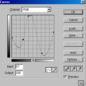
Try to use my settings but remember that in Curves tool there are miriads other possibilities than the one I have showed you. Dont limit yourself just to my settings. Try yourself and experiment a bit. You will be surprised how many possibilities this tool gives you.
If you want to know more about Curves, check or Understanding Curves tutorial.


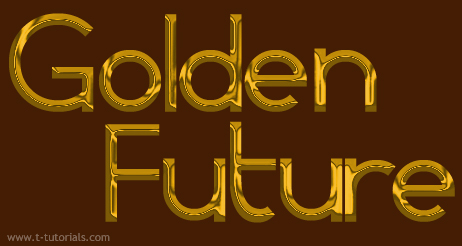
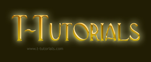
I have used the same method on a different font and this was the result.
One More Example (I am sure you will like it)
In addition to what I have already written, I have also used this procedure to make the following one.

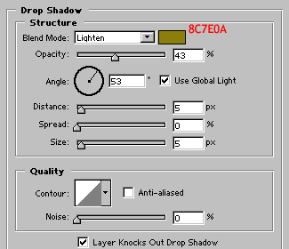
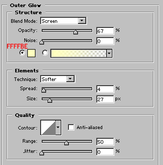
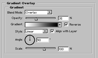
I used the very same procedure as before, but I played more with Layer Style dialog. I have added Drop Shadow, Outer Glow and Gradient Overlay in Overlay mode to make the upper part a bit darker and the bottom part lighter.
And finally here is the final one:
Pages
Submitted by Martin on 2006-04-27 17:09:14. Since then read 121931 times.
Scored 4.52 points out of maximum 5 by 126 votes.
Also take a look at other Photoshop tutorials...
Crumbled old paper texture | Learn to use Quick Mask | Red Glass Button | Modern Art in Blue | Slim button |
Rate this tutorial!
Invite a friend!
Discussion
Elena mystra307 AT hotmail DOT com said on 2006-05-12 03:30:02The best Golden text and "how-to-make-it" tutorial, I've ever seen. It's really fantastic.
Steve madaz_rx8 AT hotmail DOT com said on 2006-05-14 16:00:06
would love it if you could convert this tut for paint shop pro although sum features arent supported alot are i managed this following as close as possible http://img318.imageshack.us/img318/7632/cherie9fr.jpg
Steve madaz_rx8 AT hotmail DOT com said on 2006-05-14 16:30:46
tried a different tut pro paint shop pro and came up with this but u prolly dont care :D http://img318.imageshack.us/img318/8581/cherie20mv.jpg
Radoslav rado AT t-tutorials DOT com said on 2006-05-14 16:44:03
Steve, that is interesting... i looks funny. But if you want it to look realistic, i guess you may need to try more ;)
Steve madaz_rx8 AT hotmail DOT com said on 2006-05-15 13:59:30
Radoslav, thank you for encouragement i tried again (without compressing JPG that was the trouble with the cherie 1 plus different curves layer) there essentially the same but i accidently moved the black on the first 1 and found there was gold behing the black layer :D #1 http://img105.imageshack.us/img105/9844/sau13mf.jpg #2 http://img164.imageshack.us/img164/9592/sau29cs.jpg no i need to figure out if i can add a glow effect which i really dont think paint shop pro 9 will do maybee 10 will but i havnt bought that yet
Radoslav rado AT t-tutorials DOT com said on 2006-05-17 16:18:17
Steve, i see its getting better :) But the reflection looks a bit in a wrong according to perspective, i think. And you might also want to try to do somthing w/ the text, it looks a bit fuzzy. Just keep on going, don't surrender! xD
Leif Daniel Rognan findecano_sirfalas AT hotmail DOT com said on 2006-06-04 14:19:36
Hi.. Gr8 Tutorial, BUT there is one thing Im wondering about... I manage to do the curves, but I see your curve has many many many squares to adjust.. I have 8 I think.. How do you adjust so that U can finetune curves even more??
Micha naabz0r AT gmail DOT com said on 2006-06-04 17:11:04
Hi, i like this tutorial. But ive got a question, witch font is the first gold text you made? [the one with the gradiant background] thx :)
Martin mato AT t-tutorials DOT com said on 2006-06-04 21:16:05
To Daniel, about the curves. lol. I guess that the number of squares does not effect the strength of the Curves tool. At least I think so. Anyway, I think that the higher number of squares is there just to make small corrections possible (e.g. " that anchor point is three squares from the left and one from top" - I guess this would be pretty difficult with less squares). Anyway II., I think you wish to know how to change the number of squares.......so?.....just press Alt and click on the grid when in Curves window. :D thats it. I found this function in some tutorial on the net. thank to the unknown author :))
Martin mato AT t-tutorials DOT com said on 2006-06-04 21:21:40
To Micha, about the font. I guess that you want this font "Coronet". But you will have to adjust the spaces between letters (in Photoshop in Character palette).
Leif Daniel Rognan findecano_sirfalas AT hotmail DOT com said on 2006-06-07 17:57:49
To Martin... Thx alot. that was the trick (",) "a new world opens" hehe.. I tried alot of buttons at first, and I did press the "Alt" and then a new button came up "reset" just stupid that I didn't press the grid.. oh well. prob solved now.. thx, great site!
Lars knudgaard[a]hotmail DOT com said on 2006-06-08 23:11:22
Great tutorial! However I have a question: What are the exact values for all the points in the curve (part 13 of your tutorial)? I've tried recreating it as best I can but I end up with a green-red text looking like it just came back from a week in the sewers :/ Thank you very much! /Lars
Martin mato AT t-tutorials DOT com said on 2006-06-10 23:07:51
Reply to Lars.. Well, what you say (that about the text having greenish and reddish chues all over it) happened to me as well. I think that you have probably missed step 11, that is making the Adjustment Layer (that which will turn everything under itself to yellowish color). That should reduce all different colors and leave us with nice yellow, even gold. I hope that cleared it a little. If the problem preveils, tell me.
Mim mimounaq AT hotmail DOT com said on 2006-06-11 17:52:57
Please help me! number 10: I don't have a TEXT layer
Ray said on 2006-06-14 15:57:00
Text layer? Where in the tutorial did was a Text Layer created?
Martin mato AT t-tutorials DOT com said on 2006-06-16 22:03:01
Not TEXT layer but Text layer. Not text layer with vector writing (or created by Type tool) but with the yellow text picture. there is no text layer as such, just pictures. should be enough.
Tom tlarge1 AT san DOT rr DOT com said on 2006-06-17 00:36:56
I too found the "10. text layer" step confusing. Eventually, after many attempts, I was able to create gold text. However, my text never did have the metalic shine as in the example, but was ok. The steps after that involving curves only produced green or maroon colored text, so I gave up. Perhaps more specific details would be good in that area. I did achieve results using the Layer/Style dialog.
web designer India frenz_san AT yahoo DOT com said on 2006-06-23 10:48:04
Nice tutorial
Paul paulh AT pretzel DOT com DOT au said on 2006-09-11 04:10:36
To stop the green, red problem when you add the curves adjustment. You must make sure you add an 'Adjustment Layer' and then modify the Hue / Saturation on that. To create an 'Adjustment Layer' click on the half white/half black circle at the bottom of the layers toolbar and select Hue/Saturation.
Max DragonBoy_17 AT hotmail DOT com said on 2006-10-05 13:17:30
Not bad, but this effect can be created just as well with 2 simpel effects. Bevel and Emboss, and dropshadow. Same thing, lot easier. Also a good font is half the work when working with these types of effects.
Max DragonBoy_17 AT hotmail DOT com said on 2006-10-05 13:20:14
http://dhost.info/pathfinders/goud.jpg example of 2 gold like effects. it never matches up to the real thing though ;)
Martin mato AT t-tutorials DOT com said on 2006-10-05 20:15:50
Well, nice pic you posted but it does not much resemble what a gold look like, no offence. I agree that if one would master bevel and emboss options, it would be way easier to create the effect. But it is not as simple as you described it :D
Max DragonBoy_17 AT hotmail DOT com said on 2006-10-06 12:02:33
well my point was not to show how gold looks like when made digital, simply to discuss that the effect shown above can be accomplished with simpler techniques. i also pointed out that it will never look anything near the real stuff when made digitally. And by that i include my own as well.
mariusz mayorman AT wp DOT pl said on 2006-12-21 20:26:38
tree words: very very nice!!!
naina said on 2007-01-14 18:50:37
Superb...!! BUT I don`t understand Curves..????
Martin mato AT t-tutorials DOT com said on 2007-01-20 18:18:47
Perhaps if you wrote what you dont fully understand we would be able to explain in a form of a tutorial or an email. If you have any queries, just ask.
Tom tom_de_boeck AT telenet DOT be said on 2007-06-15 10:43:27
I used your tutorial to make invitation cards for a birthday party for my mother and grandmother. I would like to know what the master himseld thinks of it. :D http://www.imagehosting.com/show.php/780250_crop.jpg.html I really loved the tutorial. Keep making great things like these!
Martin mato AT t-tutorials DOT com said on 2007-06-17 20:10:33
Cool, I think those are really awesome results. If I was your grandma, or any other person invited with such card, I would scold you off for giving money to some proffesionals toi do it. What I want to say.... it is just awesome. Love it.
Hetherwick Ntaba Jnr hntaba AT gmail DOT com said on 2007-09-06 22:19:24
It was interesting to look at... No really 10 seconds is quite a plausible achievement. Stay cool Y'all...
Jon jonnyboijon said on 2007-09-09 03:09:43
Thanks for the tutorial! :D. I was wondering, what font is it you use in the second part of the tutorial? The one saying T-Tutorials? Thanks! :D
Atul said on 2007-09-19 12:02:02
Atul atuldarshan AT yahoo DOT com said on 2007-09-19 12:03:39
I tried the thing and given superb result but not like the one I shaw here in the tutorial, how can I send you the image result I got. I realy wish to make a small text in gold. Assist
Stanley said on 2007-12-24 00:27:01
Relly, really, great tutorial
ancient zahra AT alchemism DOT net said on 2008-02-29 21:30:50
Alchemical tutorial. Thanks man.
Suruchi suruchi_suchi AT yahoo DOT co DOT in said on 2008-04-23 13:14:43
hey the results of the tutorial seem really cool! but i am stuck at the second step itself :D in which channel do we have to write the text?? neither text comes of red color, nor it converts to white! what should i do buddy?
keith khudson1 AT bcbsm DOT com said on 2008-10-31 15:35:36
Suruchi suruchi_suchi AT yahoo DOT co DOT in said on 2008-04-23 13:14:43 hey the results of the tutorial seem really cool! but i am stuck at the second step itself :D in which channel do we have to write the text?? neither text comes of red color,
cora corakrt AT yahoo DOT com said on 2009-04-06 23:52:36
can u plz describe the FONT NAME of "GOLD" Text
Gopi gopikumarm AT gmail DOT com said on 2009-04-07 11:45:45
hi its realy nice .nice explanation too. but in some part i could'nt get sam as you (in curves)...... nice site
m hate_is_on_trial AT yahoo DOT com said on 2009-12-02 04:18:58
how do you change the background. i can't seem to do it with messing it up. tried making new layers, arranging, tried doing what you said but i couldn't understand what you meant...how you did it...how?! lol
Trojan said on 2010-07-09 09:22:11
Hi I've created some text following this guide step by step, however, I simply cannot get that 'liquid' look to it that you have there. Would it be down to the curves or something else/simple. I just can't get that fluid look. I would really really appreciate the help. This is one of the best tuts on gold, I've seen. Thanks very much for your time and effort Martin. I know it's an old post, but I hope you read it; I could do with a little guidance. Many thanks
Michael said on 2012-03-28 09:01:52
The absolute best gold text on the internet, couldn't find anything as beautiful...Amazing work, very appreciated.